
7 Cups Case Study
A redesign case study for 7 Cups - an on-demand emotional health and well-being service that provides a safe, anonymous one-on-one chat with real listeners.


7 Cups of Tea is an on-demand emotional health and well-being service. Their bridging technology anonymously and securely connects real people to real listeners in one-on-one chat.
Through my experience as a member and listener, I found three major pain points in 7 Cups that I sought to rectify in this case study:

Inconsistency of experience across mobile and desktop applications lead to relearning the application depending on the platform.

Lack of transparency and intuitive information architecture make finding features and resources difficult.

Uncommon design and experience patterns in the mobile application make navigation frustrating.

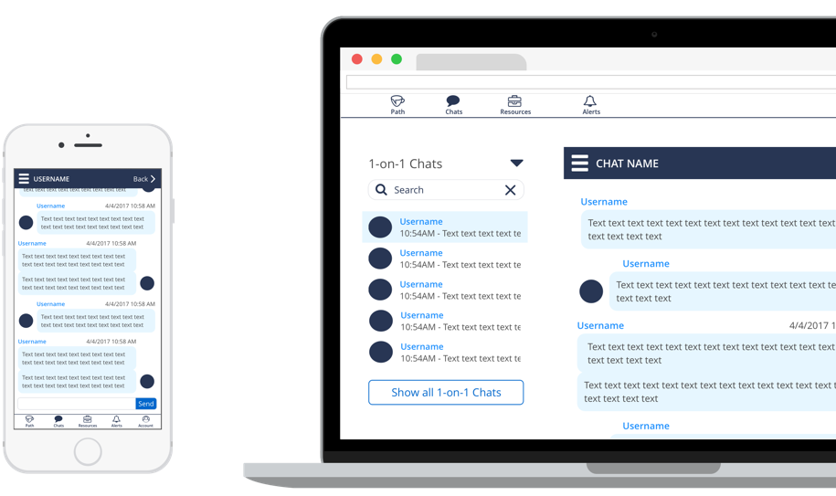
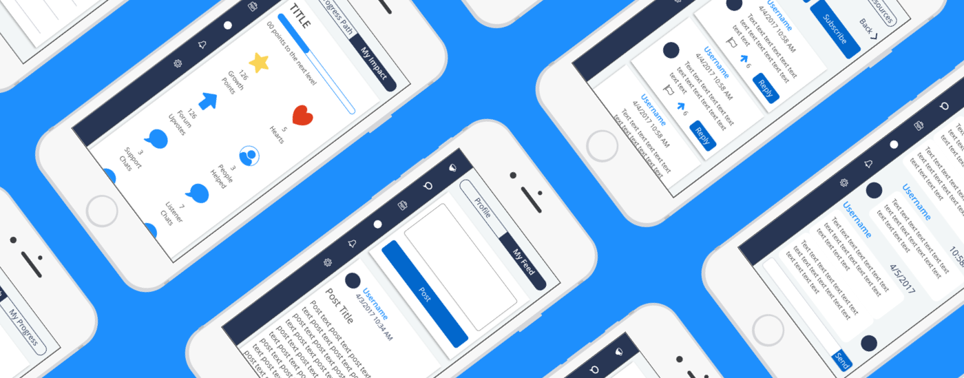
This design was based on a simple, clean design that largely relied on margins and headers to differentiate the sections. The menu bar is inspired by the design patterns found in the mobile applications of Twitter and Facebook.
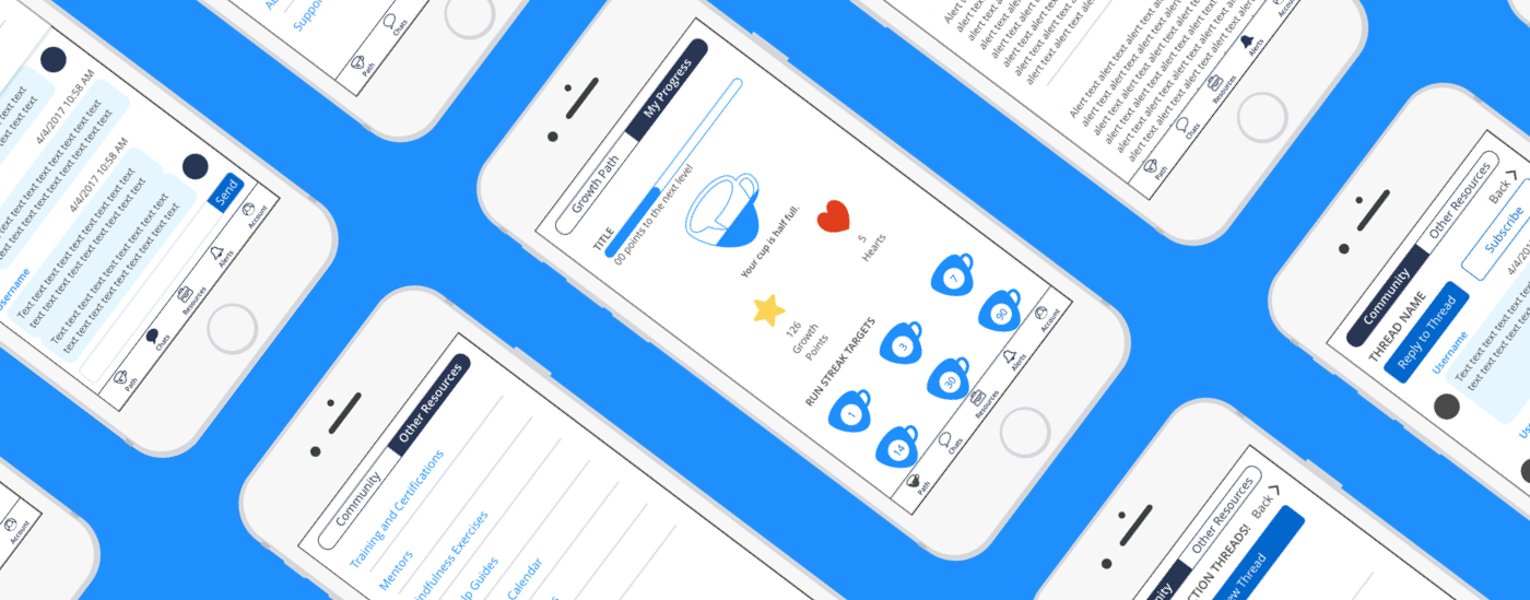

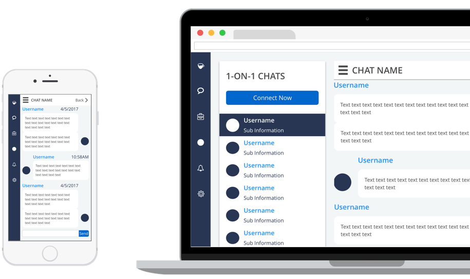
This design followed a more unconventional approach for the menu bar which primarily uses iconography and draws inspiration and influence from Apple’s Mac OS magnification effect in the dock. I used cards to differentiate sections within a page which is closer to current 7 Cups design patterns.

Due to the difficulty I experienced when trying to remember where all the resources are, I first set out to create a site map of both the mobile and desktop applications.
After doing so, I was able to group the features and screens into broad navigation items and their sub-menu items.
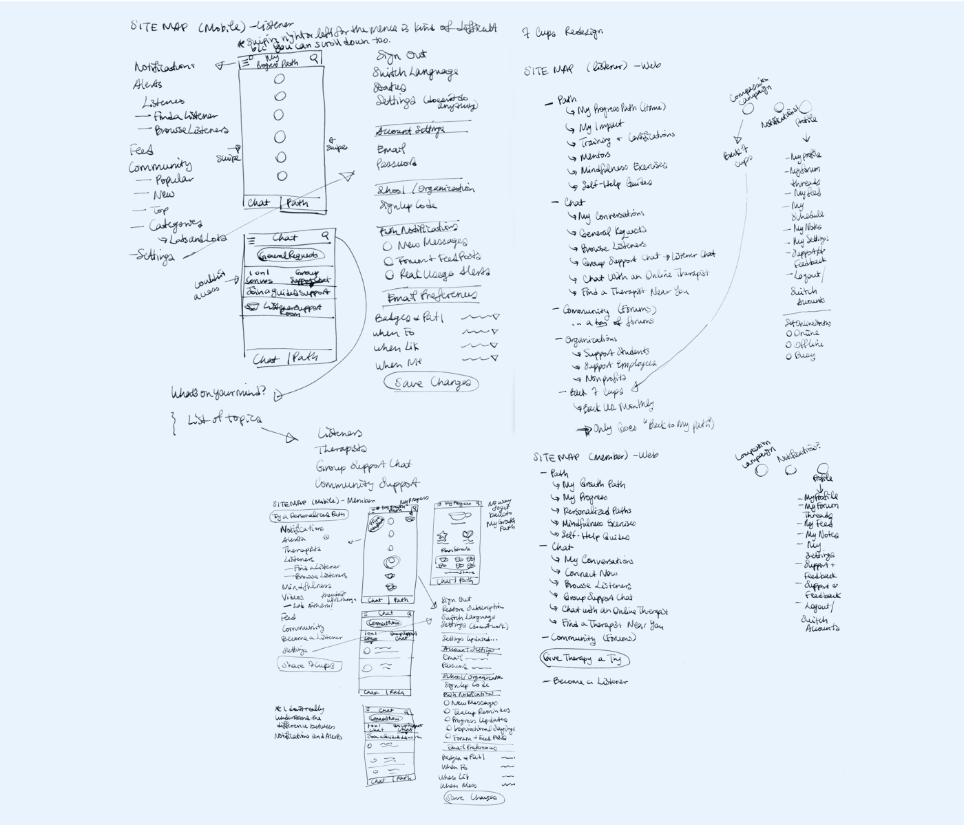

After creating said site map, I was able to group the features and screens into top-level navigation and their sub-menu items.
After wireframing, I found that one of my ideas not only didn’t work for the 310 by 352 pixel minimum screen size I had decided upon as it interfered with default iOS gestures. On the other hand, I found that the other two ideas were worth exploring and building in higher fidelity.


Here is how I addressed the three pain points in the designs:

Inconsistency of experience across mobile and desktop applications lead to relearning the application depending on platform.
The same navigation and design patterns are maintained across both mobile and desktop applications.

Lack of transparency and intuitive information architecture make finding features and resources difficult.
The navigation is at most two levels deep. More commonly used features are given their own top-level navigation item.

Uncommon design and experience patterns in the mobile application make navigation frustrating.
Sticking with common, modern design patterns eliminates unnecessary learning for first time users.
The next step would be to put both designs in front of stakeholders and users to gather feedback through guided design discussions and user testing.
